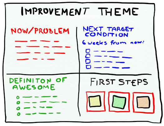
Improvement Theme is a tool in the form of a poster that works as a conveyor belt for continuous improvements once the Retrospective is over.
I’ve been reading a little bit about Toyota Kata and seen great presentations on the concept. In order to make it practical and useful for me I found myself tweaking it and packaging it in a concept I’ve come to call Improvement Theme. I’ve tried this concept a couple of times now and found it to be a good tool to extend improvements beyond the Retrospective and bringing it into the daily work. In this article I describe how to create the poster and how to use it as a tool for continuous improvements.
The Improvement Theme is a poster. I’ve been using magic charts since they are easily moved between the room in which the retrospective is held and the teams wall.
 The charter consists of five areas.
1. Name of the Improvement Theme
2. Now/Problem – Description of the current situation
3. Definition of Awesome – How would we like it to be?
4. Next Target Condition – X weeks from now, what has changed?
5. First Steps – 3 slots for three post-its that describe the first (next) actions we will take?
It’s a living document, preferable put up next to the scrum/kanban wall. Once or twice a week the team reviews the theme and agrees upon new actions as they get completed.
When X weeks has passed the team does a review of the theme itself. If they want to continue on the same theme they identify a new “Next target condition”. Otherwise they create a new Improvement Theme poster.
Here follows an extensive description of how I’ve been using the concept as a tool for improvement and a more in-depth description of the different aspects of the poster.


