Improving continuously requires to be truly aware of one’s current condition. A lot comes “for free” when using Kanban (visualization policies, feedback policies and the measure of flow). The Kanban board gives a “snapshot” of the current situation, but a time aspect is needed to better understand trends and evolution. That is where the charts and graphs come in. Current Kanban best practices recommend the usage of certain graphs like the Cumulative Flow Diagram (CFD) and Statistical Control Chart.
Here I share a few simple examples of the graphs produced by some of the team I have the chance to coach and what the graph can tells us on the team (this content is an extract from the “Kanban Kick-start Field Guide” to be published soon). For help on how to produce these charts, check the invaluable Excel how-tos by Håkan Forss on CFD, Control Chart and Spectral Analysis.
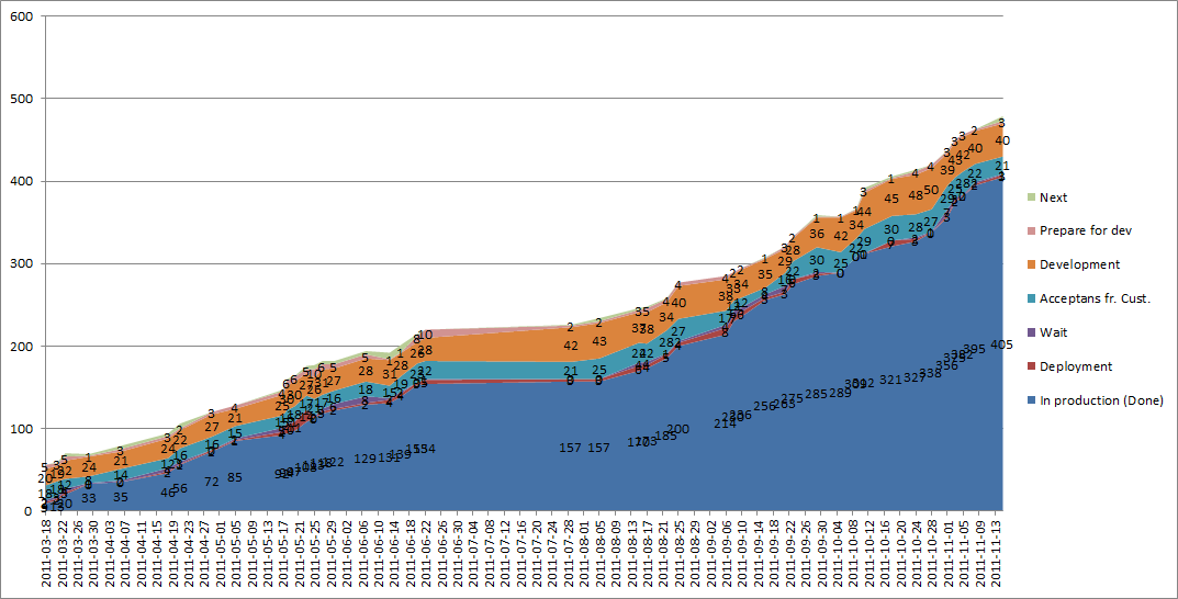 |
| Example of a CFD for a team of 6 persons working with a document delivery product. The flat area in the middle is the summer holidays (they tend to be rather long in Sweden). Note that the slope is steeper by about 10+% by the end of the year meaning that the team has improve its capability, or the context has changed (it was the former in this case). |
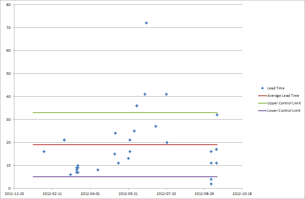 |
| Example of a Control Chart for a team of 10 persons working with windows applications maintenance. This CC shows the time it took to complete “Small” work items from January to August. Using this graph, the team could tell a customer: “We can deliver a S work item within 33 days with 85% chance, though it can be as low as 19 days for 50% of the items”. The area between the upper and lower control limits is rather large, which should trigger the team to analyse the root causes behind the delay for the work items “above” the upper control limit. Fixing the root causes (creating new policies or modifying existing ones) would allow for less variability. |
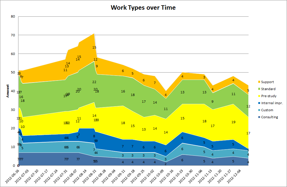 |
| Example of other graphs useful for flow analysis: the “work types over time” graph. This graph shows the evolution over time of the amount of work items (grouped per work types) on a team’s board working with a content management platform. From this graph we can see that the team as a rather constant mix of work items, that the team works to reduce the WIP on its boards though without using explicit WIP limits (the total amount should then be rather constant), and that the team has worked to reduce the amount of support issues. The trend seems to evolve in the right direction (though the amount of internal improvement seems to diminish, which is not good) |
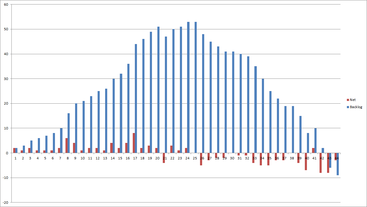 |
| Example of other graphs useful for flow analysis: the “queue size” graph. This graph shows the evolution of the size of the queue (or backlog) for “standard” work items over the year (the numbers are week numbers). This is the same team as shown on the previous graph. The “net” column shows the difference between incoming and completed work items during the week. The team started to use Kanban by week 24. You clearly see that the team focuses more on “standard” work type from the introduction of Kanban (the net is negative). The negative queue is a glitch of the Excel formula: the queue is simply empty. |


