The following is an excerpt from the recently released book by Martin Christensen and me titled Holistic Product Discovery.
It’s been a 3-year journey that started with a 20-page draft. Numerous iterations later, here we are. Thank you to the fantastic community of readers for your invaluable feedback.
Let’s begin.
A story about a product
Awkward is the word that summed up this meeting. The product manager had said, “We just need to find the right customers”. One of the team members replied, rather incredulously, “But no one seems to want to buy the product. Do we actually know if we are fulfilling the customers’ needs?”
Now with an even more forceful tone, the product manager shot back, “I know exactly what the customers want. I was a customer myself. It’s not hard to build a great product. We just lack key features. If we just build them, the customers will open their wallets!”
Let’s rewind the tape here. Three months earlier, the product manager had defined a clear and measurable business goal. The ambition was to build an analytics tool for businesses. With the goal in mind, a UX designer recruited and interviewed potential users of key target customers. To distill the insights, the UX designer re-used a trusted persona template. The solution was subsequently defined in a prototype that was tested with a handful of users that fit the persona. The results were positive. The users really appreciated the functionality. It was time for the developers to pick up the baton.
The UX designer joined the development team and worked iteratively and incrementally to refine the solution concept. The team used a technology framework they were comfortable with which shortened the development time. There was great teamwork and no major hiccups. Launch day was just around the corner and expectations were running high.
And, then… silence.
The phones didn’t ring. There were no customers standing in line.
What happened next was that the team continued building features and, at the same time, the product manager expanded the sales team to find willing customers. But still, customers weren’t signing up.
Fast-forward to almost a decade later, the product still exists but doesn’t have traction on its own.
Even in retrospect, it might be hard to see all the intricacies that led to this failed product. Everyone did their best and the collaboration felt good. So, what do you believe were the causes behind its failure?
What caused this mess
Let’s assume the role of a (very amateur-ish) psychologist for a moment. We’ll sit down in our comfy chair and look at what traps the team fell into.
Confirmation bias
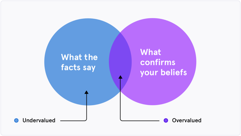
It was obvious, afterwards, that the business goal lacked substance. The assumptions hadn’t been validated. When the product was ready to be shown to the world, it didn’t matter that the users were happy, their managers (the customers) didn’t want to buy the tool. The product didn’t provide value to senior stakeholders.
This is called a confirmation bias, the impulse to favor information that confirms one’s hypotheses. The product manager had an idea and wrote a business goal. The confirmation bias led them down the rabbit hole. They were not willing to question the validity of their decisions.
Optimism bias
The fight-or-flight reaction from the product manager was that the product just lacked key features. They believed in their idea so much that they were sure there would be a positive outcome.
This is a symptom of an optimism bias, the belief that we are at a lesser risk of experiencing a negative event compared to others. We underestimate the problems that could occur in the future, and we don’t take them into account. A decision to release a bad product, hoping your customers will adapt and buy it anyway, is a clear example of the bias.
Output over outcome
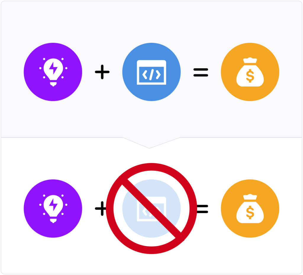
The product manager valued features (output) over what the customers and users wanted to achieve (outcome). This mindset made the product manager blind to the potential motivation for buying the product.
The graphic above is inspired by Melissa Perri. Take a moment and really look at it for a few seconds. In product development, a massive trap is that we tend to think that if we just have A) ideas, and B) we build them, we will C) make money. This can’t be farther from the truth. The reality is that ideas are useless unless they solve a problem. Customers will pay for solving a problem, an outcome, not an idea.
One trick pony
The UX designer used a silver bullet type of process, that is, a user-centered design process with a specific set of activities. They interviewed users that were introduced by the customer, but the customers themselves were never interviewed. They used a rigid persona template to distill the insights, that did not discern between users and customers, and was perhaps not even a fit for this type of problem. They went directly to a prototype, without exploring several possible solutions, and tested this only with people strongly matching the persona.
Coming back to the same way of working regardless of the context is typical for a ‘one trick pony’ designer, a person who is skilled in one area and that will only have success in that specific area. In this case, it led to totally overlooking the difference between customer and user, and possibly also to not finding the best solution, only one solution.
If the UX designer would have been comfortable with other methods as well, they would have had more tricks up their sleeve. This would have led to them finding the right set of activities for the right context.
We have all been there. The ‘one trick pony’ is a very common trap to fall into in the beginning of your career.
IKEA effect
The UX designer fell in love with their first solution and stuck to it. They only created one single prototype to test with users, which resulted in only minor improvements. This is almost the same trap as the product manager fell into, that of optimism bias. The UX designer got too invested in the product since they came up with the solution themselves. This is the so-called IKEA effect. If we, ourselves, are the creators, we perceive our creations as more valuable than what they really are.
Unchallenged assumptions
Just as in the story above, the development team had a perceived great way of working. However, they were too comfortable with what they already knew. They weren’t open to challenging their assumptions about what technology framework to use. This could possibly have led to feasibility issues, which is a common problem in many other contexts.
Not challenging assumptions, often due to confirmation bias, is very common, mainly because it is so easy to underestimate what will happen if an assumption is false.
Sunk cost fallacy
The product manager and the team kept the product alive for many years even though it never actually got any traction. From an objective point of view, the product should have been killed early on in the process. What kept it alive was that the people involved felt they had invested so much time and effort. They didn’t want that to be a waste. This is called the sunk cost fallacy in behavioral economics.
Siloed work
The collaboration within the team was done in silos. The product manager came up with the goal, the UX designer created a prototype and the development team brought the product to life. Each step just focused on execution, rather than challenging existing assumptions.
The biggest issue of them all
Underpinning a lot of thinking in organizations is the belief that the more we do, the better it will be. It is common in product teams that every idea gets into the product backlog, and every new idea that pops up along the way also ends up being built, as long as there is time and money. This happens due to all of the biases listed above (and more).
Looking out for biases can be a first step towards a more healthy way of building products. To paraphrase famed Silicon Valley product executive Marty Cagan, try to find out the number of features defined from the start of the project and compare it to the number of features that were actually built. If the number of features built is roughly the same or more as the number of features defined, the product is probably unhealthy. If the number of features built is less, someone has been thinking, prioritizing and eliminating biases.
In our story, there was not much Discovery done at all, really. The UX designer did not intentionally try to invalidate any feature ideas. The features defined got built. It wasn’t the smart thing to do, it was the easy thing to do.
Product is Hard
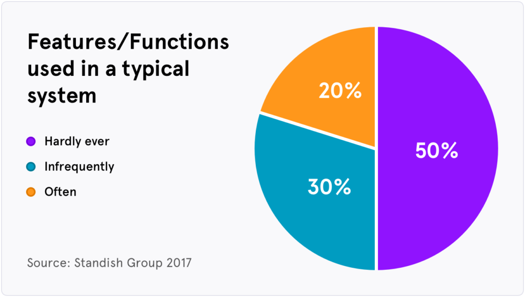
It is good to remember that product development is hard and, like in the story above, we sometimes end up in failure. The statistics are quite bleak. According to an estimate by the Standish Group, only 20% of the features and functions built are often used by users. The rest is either infrequently used (30%) or hardly ever used (50%). This matches our combined 40 years of experience within product development. The reality is this: most of the stuff we build don’t provide value.
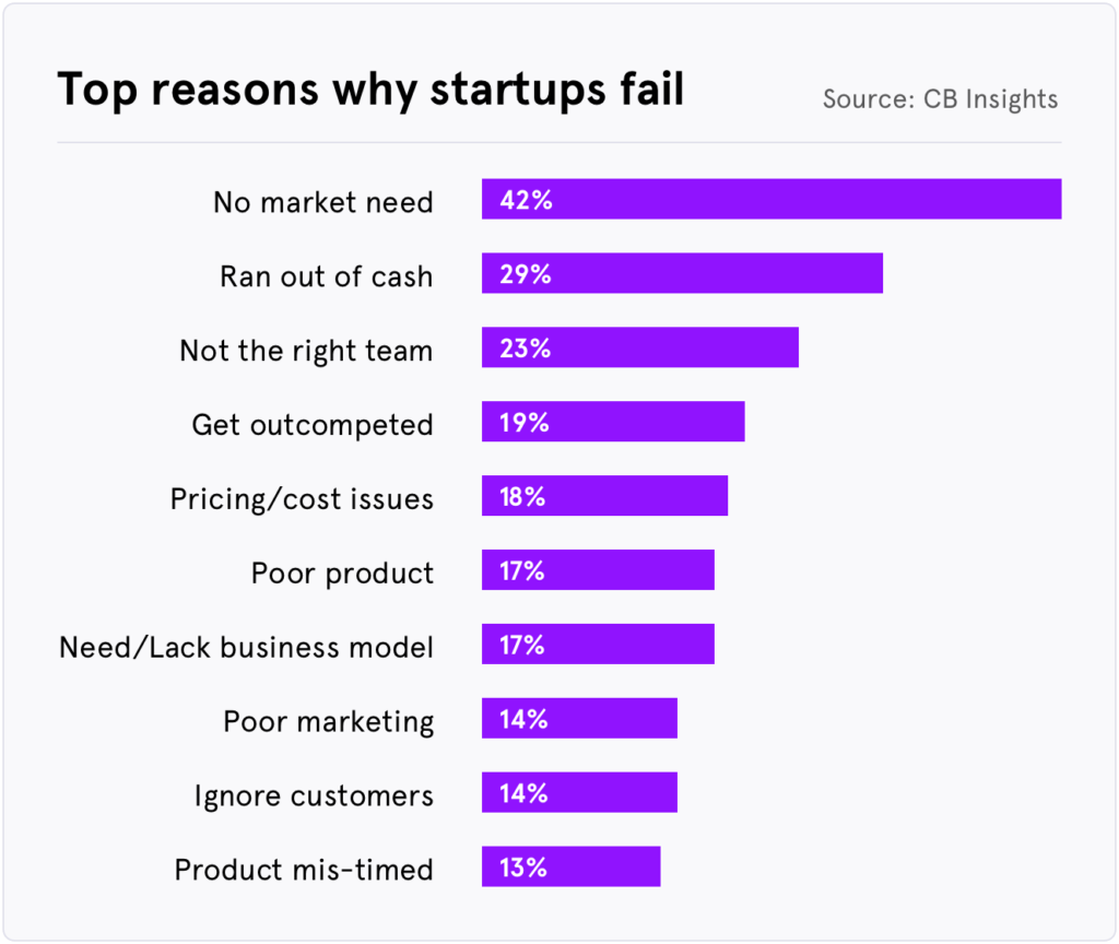
And here’s another uncomfortable statistic, 42% of startups failed because there was “no market need” for them, according to CB Insights who looked at post-mortems from 101 failed startups. The “no market need” category most likely means that there had been no Discovery, a situation likely due to biases and the inflated egos of founders.
Now, imagine being in a startup and spending years building a product that no one wants. It must be incredibly frustrating and demoralizing. Never forget, product is hard.
A failed product from history, and one from recent times
Even with a team of smart people, with impressive experience, you can still end up with a failed product. In the following section, we will look at a few case studies of products that have gone awry. We are telling these stories so we can learn from them and we can find many of the biases we have listed in the previous chapter. We’ll begin with a story of a failed product from many centuries ago.
Vasa ship
One of Stockholm’s most famous sights is a museum that celebrates one of Sweden’s greatest failures, Vasa, the mighty warship that foundered after only sailing 1,300 meters from harbor on its maiden voyage on Aug. 10, 1628.
Vasa was built during the height of Sweden’s dominance in the Baltic region. The ship was supposed to be the crown jewel of the Swedish navy and was commissioned by King Gustavus Adolphus. At the time, Sweden was at war with Poland-Lithuania and it was felt the country needed a great naval presence in the Baltic Sea. The king wanted Vasa to be a symbol and showcase of Sweden’s power, and the ship sure had power with the largest concentration of artillery in a single warship in the Baltic. But Vasa’s greatest strength was also its weakness.
On a calm afternoon with only a light breeze, Vasa set sail on her maiden voyage. After only 15 minutes, the journey ended in catastrophe.
The ignoble story of Vasa is one of the most famous in Sweden, taught in schools for centuries. But, what can we, as product professionals, learn from this failure?
Money was clearly not a problem. Vasa was one of the most expensive projects at the time
You shouldn’t always listen to the customer. The king micromanaged, for instance, how long the ship should be.
Acknowledge test results. To test the ship, the common practice was to have 30 men run back and forth on the ship in a harbor. Such a test was conducted but it had to be aborted due to the risk of the ship capsizing.
Don’t be under time-pressure. Sweden was at war and the king wrote letters to speed up the construction of the ship.
These were just a few things to learn from this story. If you’re visiting Stockholm, we highly recommend you go to the Vasa museum to learn more and see the raised ship in its awesome form.
But, now, let’s look at a failure from recent times.
Juicero
The idea was simple. Customers would buy single packets of vegetables/fruits, put them into the machine, a $600 juice press, and voila! Freshly squeezed nutritious juice. The problem, and a pretty significant one, was that the product wasn’t needed. A Bloomberg News reporter did a story about Juicero and discovered that you could just as easily squeeze out juice from the pack itself, begging the question: why would I need the machine?
So, what can we learn from this failure?
Excess of capital creates complexity. Juicero commissioned the famous industrial designer Yves Behar’s firm Fuseproject to design the product. It was beautiful but there were many details that were unnecessary. For instance, before you could use a packet, you had to scan a QR code. Venture capitalist Brian Einstein wrote in a piece about the product that the complexity was unnecessary and likely arose from a lack of cost constraints during the design process. The juicers were also connected to the internet to enable consumers the ability to get information about the packet’s expiration dates. The packets, however, had expiration dates written on them.
Juicero’s decline was fast. The company was founded in 2013 and defunct by 2017. During the course of 4 years the company raised $120 million in capital and recruited the former President of Coca Cola North America to be its CEO. But it only took a few months after the Bloomberg article and the company was squeezed out of business.
Vasa and Juicero are just two examples and there are so many more throughout history. Who can forget “New Coke” or more recently Amazon’s Fire Phone? These stories show that even kings and prominent venture capitalists can be wrong, very wrong. We hope that this chapter has given you insights into what pitfalls and traps to avoid. Just knowing about them will make you a better product professional.
Exercises
- Have you experienced failure in product development? Reflect on a product/service that you have worked on that didn’t meet expectations. Jot down on a piece of paper what you believe were the key factors why it didn’t go as intended
- Revisit the different biases featured in the chapter and think about which ones you have experienced during your career
That was a sneak peek of the Holistic Product Discovery book. If you’re interested in learning more, visit the book website.


